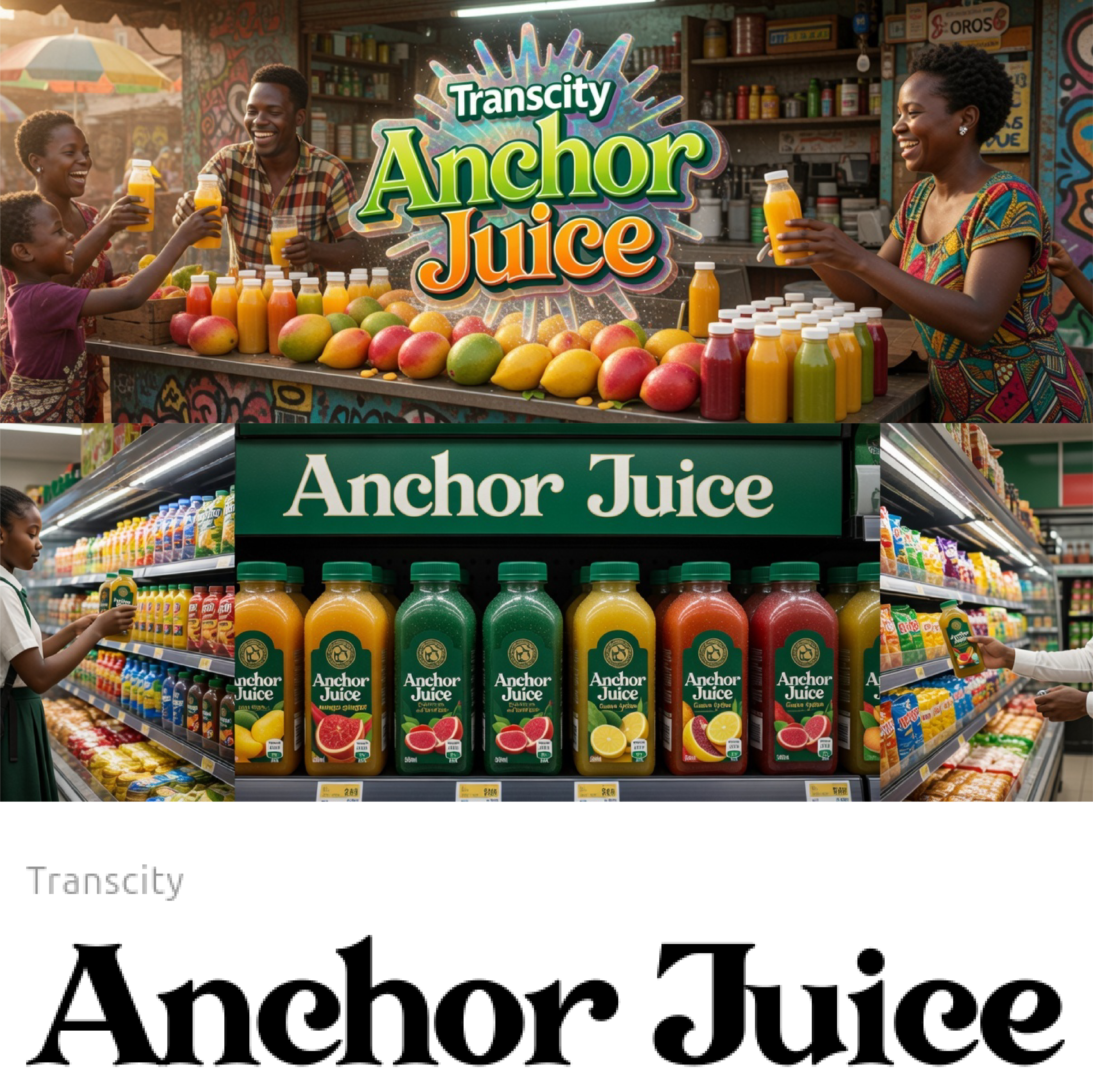
Multi-Disciplinary Designer & Content Strategist | 6+ Years of Scaling Brands through Web, Packaging, & Visual Storytelling. How I help your business grow: Web Design | Packaging Design | Content Creation | Social Media Management. The Result: A unified brand presence that commands premium pricing and builds lasting trust.
Industrial feel of modern agriculture by grounding the brand in nature. By combining a rising sun with a sweeping green leaf and furrowed earth, the logo communicates growth, sustainability, and the literal lifecycle of a farm. This organic flow builds immediate consumer trust in the freshness and purity of the farm's produce.
Read more
visualize personal growth and inner brilliance. By merging a lightbulb—symbolizing ideas and clarity—with a rising human figure, it positions the initiative as a catalyst for "unlocking potential." The bright yellow "sun" at the core represents the spark of power within every girl, creating a beacon of hope and mentorship.
Read more
The logo solves the friction of traditional refueling by emphasizing speed and optimization. The flame icon doubles as a "location pin," signaling on-demand mobile service. Using bold yellow and red gradients, it conveys high energy and urgency, ensuring the brand stands out as a fast, reliable solution for fuel on the go.
Read more
The logo solves the "heavy and static" industry stereotype. By using a rising phoenix within a circular flow, it represents speed and constant renewal. This communicates that your car and machine exports aren't just freight—they are "smooth sailing" transitions.
Read more
The logo solves the challenge of merging legacy with sport by nesting a soccer-ball silhouette within a protective shield. This "cradling" shape symbolizes the matriarch’s charitable embrace, turning a sports-focused brand into a powerful emblem of love and community support.
Read more
The challenge was representing energy movement without looking static. The design solves this with a teal-to-blue gradient and teardrop blades that imply continuous rotation. This creates a modern, high-tech visual for a brand focused on fluid power and efficiency.
Read more
The logo uses fluid, minimalist lines to merge a cyclist with a heart shape, solving the "clinical" look of most bike brands. It captures the emotional side of riding, making the brand feel approachable, high-energy, and deeply passionate.
Read more